This time, I will introduce the basics of responsive support for smartphones in CSS, “Media Queries”.
What are Media Queries?
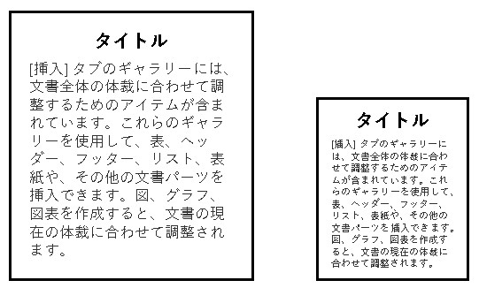
Media Queries is “a function to switch CSS according to the displayed screen size “. This is a necessary specification when creating a “responsive web design” that changes the screen design on smartphones and PCs.

For example , you can set behavior such as ” decrease the font size when the screen size is below a certain size ” with a media query.
Media queries are useful when you want your site or app to adapt to common device types (such as printers and screens) or specific characteristics (such as screen resolution or browser viewport width).
https://developer.mozilla.org/en/docs/Web/CSS/Media_Queries/Using_media_q
Conditions for using Media Queries
First, you need to specify the viewport as a meta element in the tag inside the head. As shown below, specify the viewport for the name attribute of the meta element, and describe the viewport settings for the value of the content attribute.
<meta name="viewport" content="width=device-width, initial-scale=1">A viewport represents the currently visible area in a computer graphic. In web browser terminology, this is generally the portion of the browser window, excluding the user interface, menu bar, etc. i.e. the part of the document you are looking at.
https://developer.mozilla.org/en/docs/Web/CSS/Viewport_concepts
In WordPress , the viewport is basically set from the beginning, so you don’t have to worry about meta tags .
Basic way of writing media queries
A media query can be specified by including the display @media screen and. By entering ” (min-width: XXXpx) ” after that, it will be specified as ~ when it is XXXpx or more.
* It works without screen and, but it seems that there are many cases where it is explicitly included.
/* Apply CSS when the screen is 640px or larger */
@media screen and (min-width: 640px) {
/* Put selectors to be specified here */
}
Conversely, when it is less than XXXpx , it will be specified as ” (min-width:XXXpx) “.
/* Apply CSS when screen is 640px or less */
@media screen and (max-width: 640px) {
/* Put selectors to be specified here */
}
When ~ XXXpx or more and ~ XXXpx or less, if you specify ~ at the same time, connect with and.
/* Apply CSS when the screen size is 768px to 1024px */
@media screen and (min-width:768px) and ( max-width:1024px) {
/* Put selectors to be specified here */
}
By specifying this media query, it becomes possible to change the CSS according to the screen size.
summary
Introducing media queries. By learning media queries, you can create a “responsive web design” that can change CSS according to the screen size.
Please refer to it.
