
- What is ABC analysis?
- Create an ABC analysis chart
- Create Composition Ratio and Cumulative Composition Ratio
- Making up the Composition Ratio
- Composition ratio Cumulative total
- Create a graph of the ABC analysis
- Composite graph (set vertical bar – line on second axis)
- Change the series
- Completion of parade diagram
What is ABC analysis?
ABC analysis is based on the concept that the top 20% of sales account for 80% of total sales, and is used to create strategies based on graphs.
This ABC analysis, also known as “priority analysis,” is a method of analyzing the financial importance of raw materials, products (goods), etc. in inventory management.
It is similar to a diagram called a “Pareto analysis.”
Create an ABC analysis chart
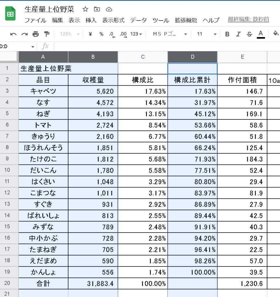
First, the tables necessary for ABC analysis were created. Again, the open data “28 Kyoto City Agriculture and Forestry Statistics (Vegetables)” was downloaded and processed.
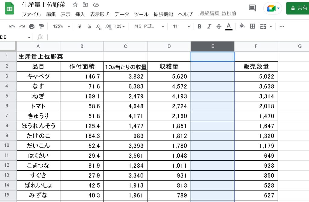
Create Composition Ratio and Cumulative Composition Ratio
To perform an ABC analysis, we need “Composition Ratio” and “Cumulative Composition Ratio,” so we add columns.
This time, columns for “Composition Ratio” and “Cumulative Composition Ratio” are added.
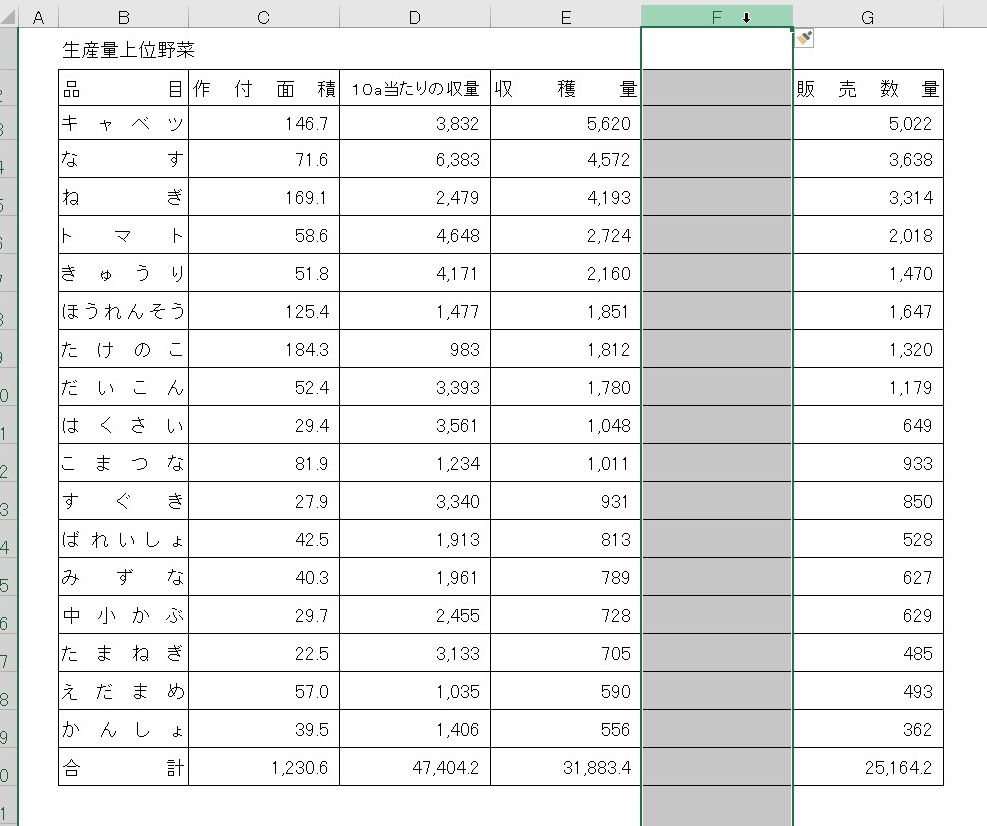
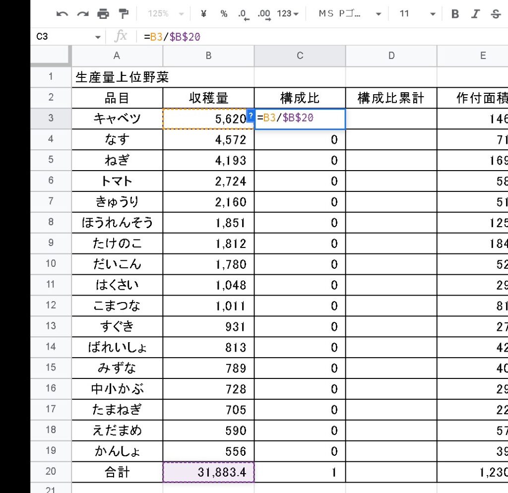
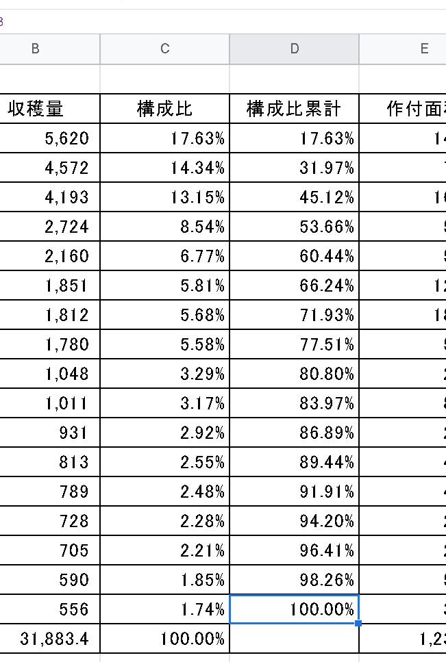
Making up the Composition Ratio
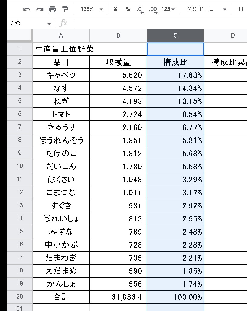
Calculate the composition ratio. The percentage of the composition ratio is obtained by dividing the “Harvested Volume” by the “Total Harvested Volume.”
Auto-fill the cells below and copy the formula to the end. Fix the total cell with an absolute reference.
If the display format is changed to percentage, it will be displayed as a composition ratio (percent).
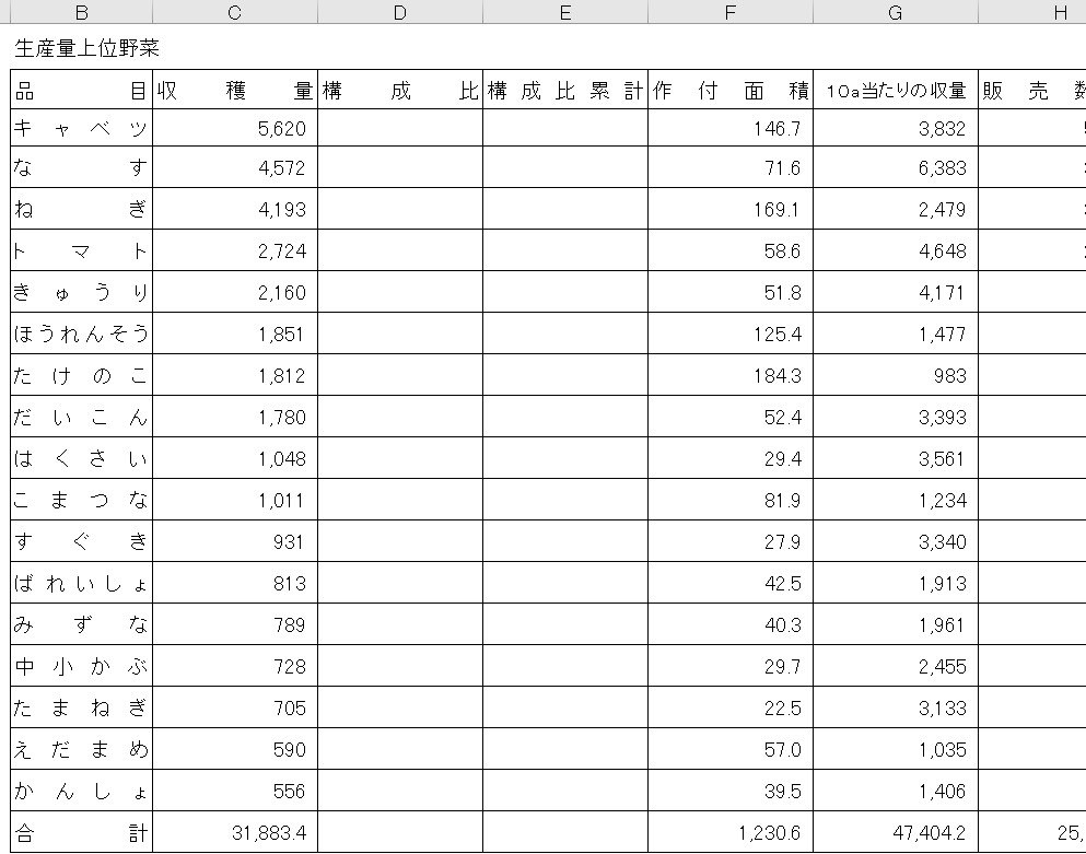
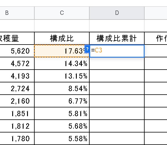
Composition ratio Cumulative total
The first line is equal to the next line. The first row is equal to the next row.
The next line should be “Previous Component Cumulative + Component Ratio” to make it cumulative.
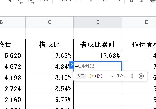
Then, if you do an auto-fill, you should see “Component ratio cumulative total 100%” at the bottom of the page.
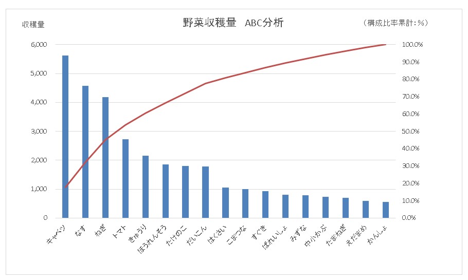
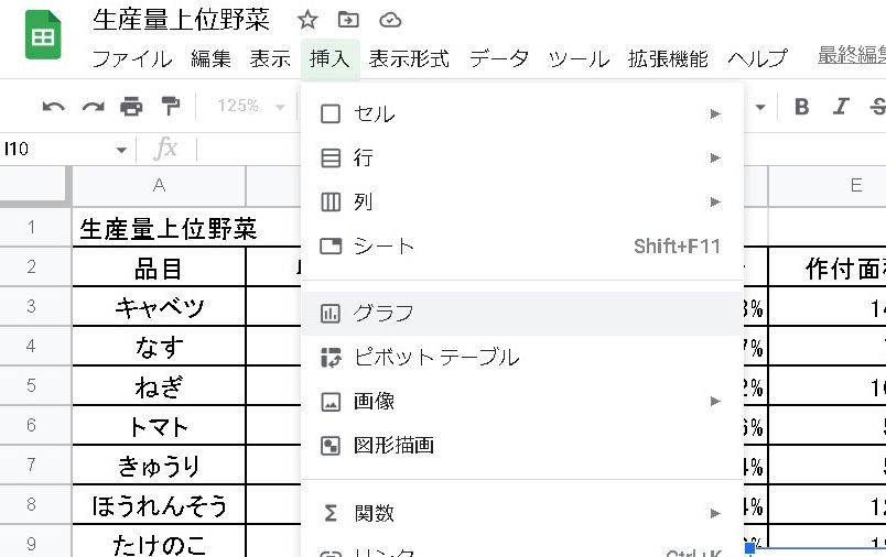
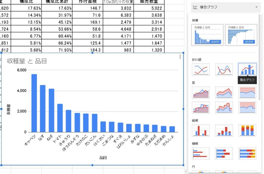
Create a graph of the ABC analysis
The three categories used in this section are “commodity,” “harvest volume,” and “cumulative composition.
In a nutshell, in order. First, create a 2-D bar chart using “Item” and “Yield”.
Selecting a bar graph completed the bar chart.
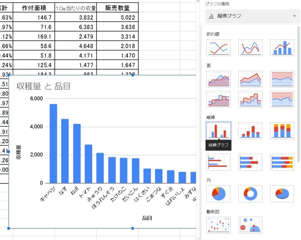
This time, we will use a “composite graph” instead of this graph.
Composite graph (set vertical bar – line on second axis)
Since this is an ordinary bar graph as it is, we will change it to a “set vertical bar – line on the second axis” composite graph.
Add another range” to the data range.
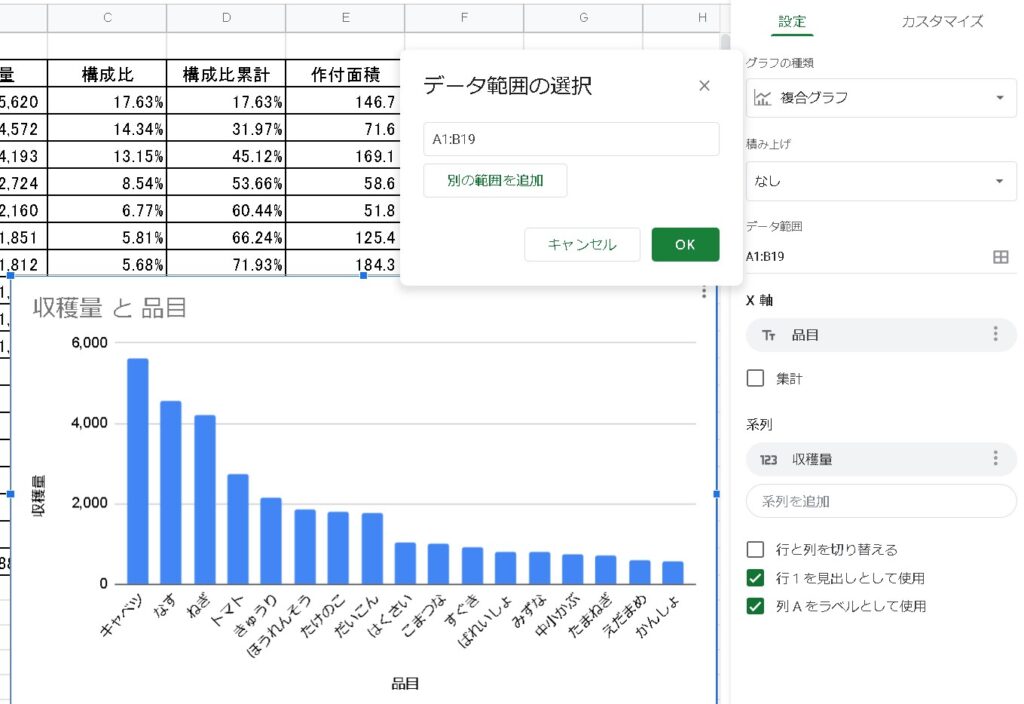
Select the columns for the component cumulative total.
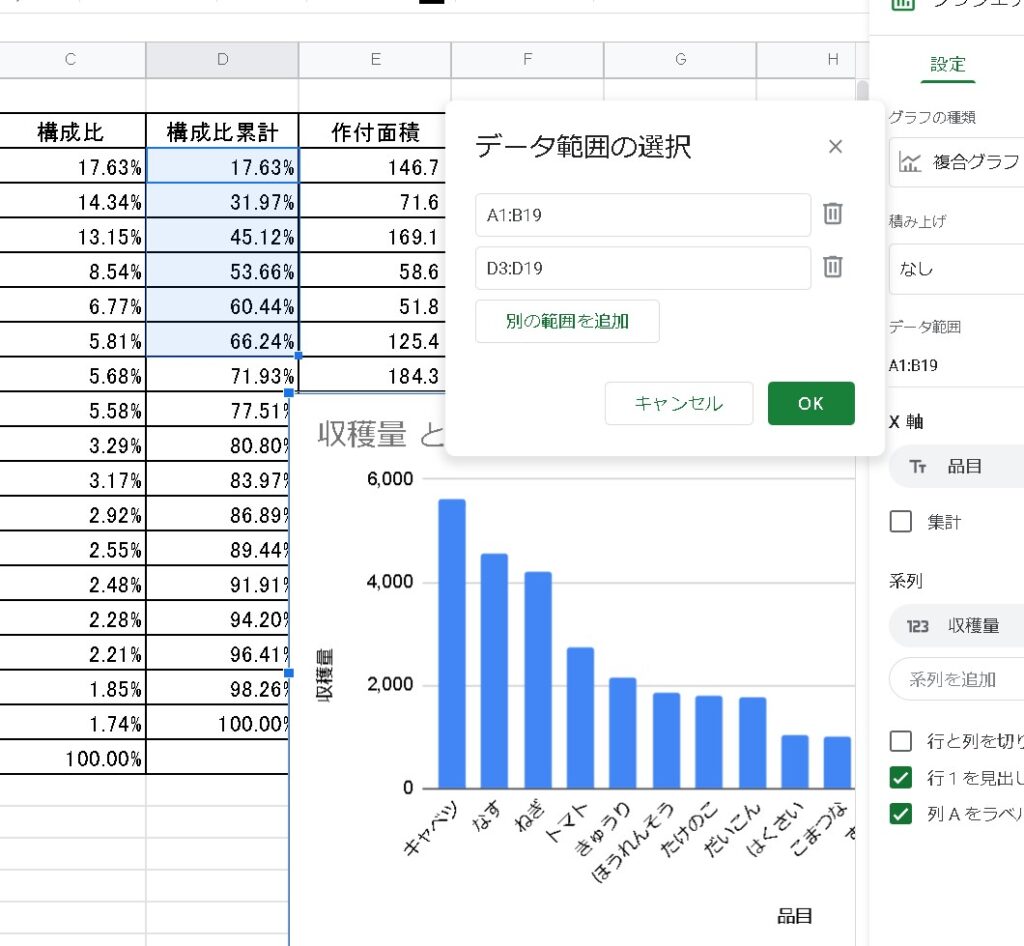
Now we have a composite graph.
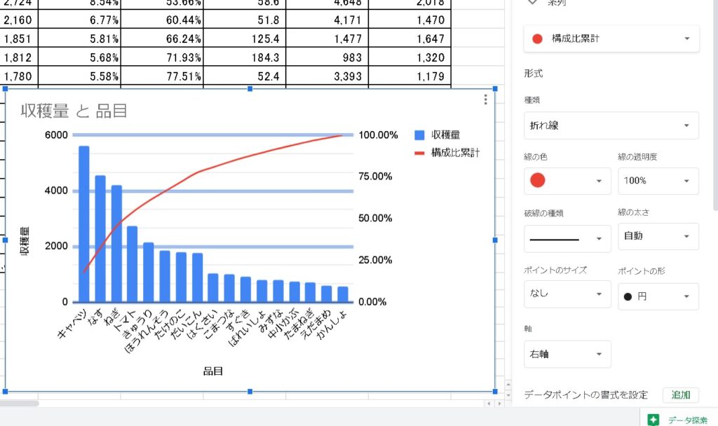
Change the series
As it is, the graph’s yield and component ratio cumulative total are on the same axis with the same value, so change it. Once you have selected “series,” switch to the component ratio cumulative total.
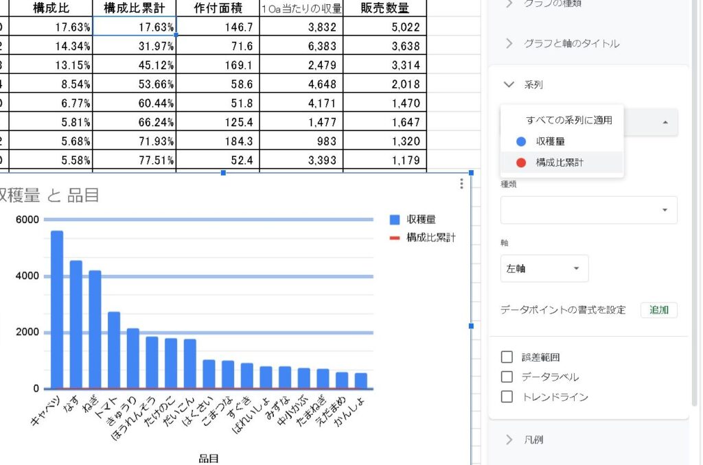
Change “axis” to “right” axis.
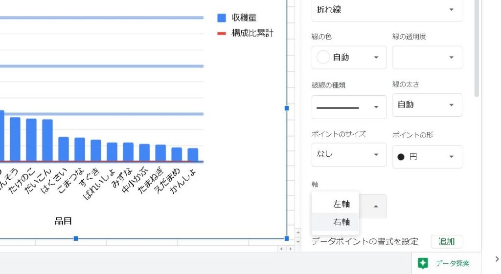
Then the component cumulative total became a line graph on the second axis!
Completion of parade diagram
So now we have a graph of the “ABC Analysis” parade chart!
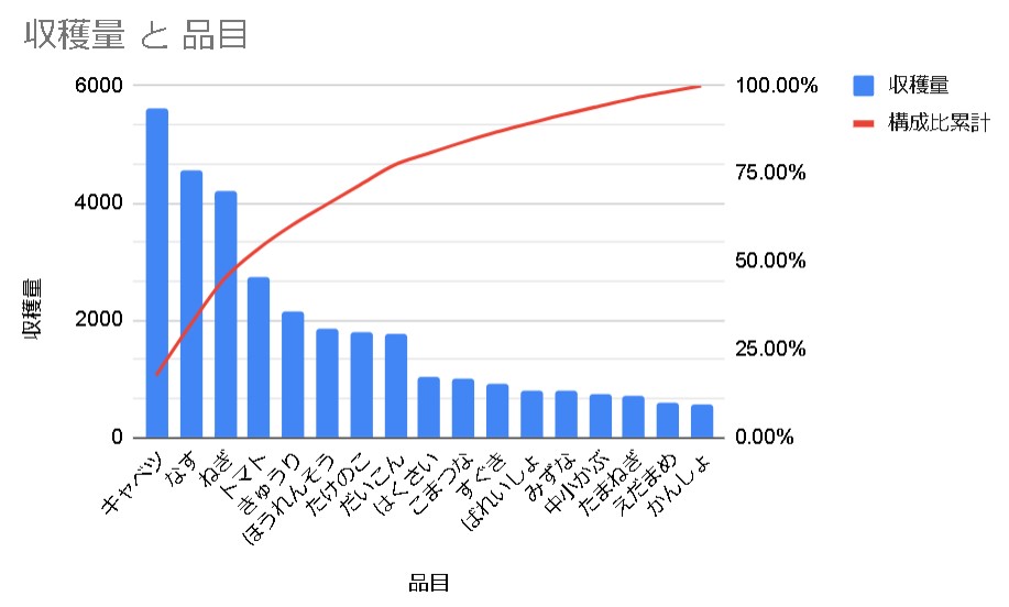
Based on this graph, what are the top products? What is the cumulative sales composition? Which products make up the top 20% of sales? You will be able to analyze these questions and more!
Please refer to 😃.